

SFMOMA App redesign
Heuristic Evaluation • Redesign Goals • User Research• Personas• User Flow • Wireframes• User Interface • Moodboard
Project Overview
SFMOMA is an app based on tourists' travel data. However, the original app suffered from confusing functionality and pop-up ads. Based on user research and feedback, I redesigned the app
My Contributions
As this was an existing application, the first step was to analyse the flow and overall aesthetic appeal of the application. From there, my job was to simplify the process as much as possible and make it intuitive for the user, while improving the overall visual appeal of the application. The most important part of the project was to design the ticketing process to ensure a smooth experience for the user.
Revising the flow
From the existing app it appears that all the functional areas are not fully used. We also had difficulty finding specific information about the art gallery and the entire visual interface is not connected to the art gallery in any way and the color scheme is unappreciable. All we had to do was make it as logical as possible


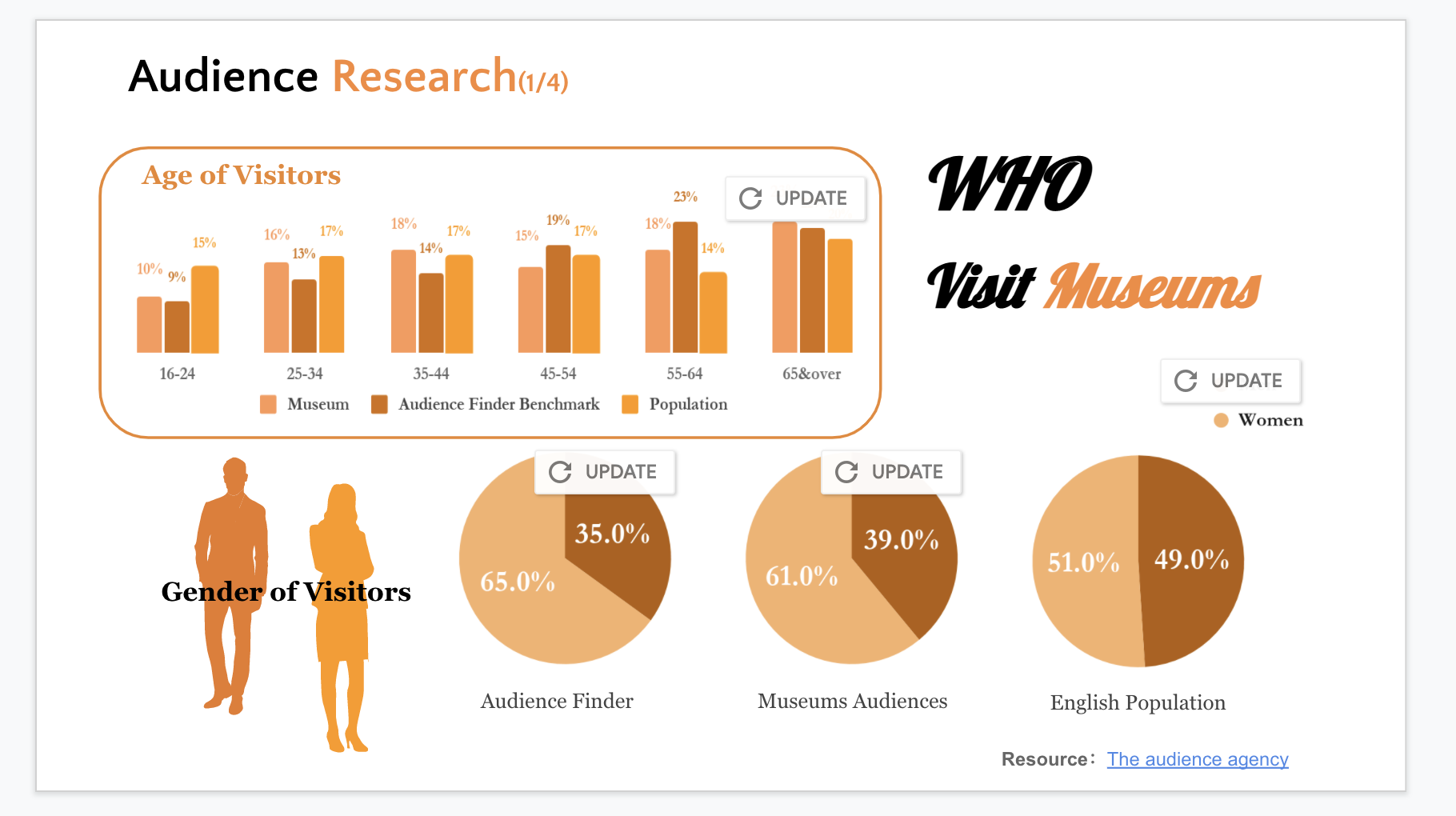
To better design, I conducted user research.According to the results of the user research, the 35 to 65 age group has the highest number of people going to museums, and a large percentage of them are women. However, reviews of the SFMOMA app show that the app feels poorly used and that there is still a lot of room for improvement.

Meet Tom, a 35 yrs, family-focused product manager. where did Tom come from? He is a direct result of the interviews and findings collected during the research phase of the project. While conducting the interviews, I noticed some patterns that were beginning to form and analyzed them. From this emerged Tom's prototype.

Defining the process
After that, I started to create a user process that showed how the platform would be organized. I envisaged a number of features and ensured that they were incorporated into the plan.

low-fidelity wireframes

I constructed low-fidelity wireframes to implement the design ideas and tested the entire framework. After testing, I improved a few details.

User Interface.I tried to keep the overall interface as fresh as possible and strongly differentiate the functions. Instead of using large blocks of color in the design, different images are used to represent different functional divisions. However, in order to integrate the art gallery elements, I have made a color design in the font.

Moodboard.I gathered designs and inspiration from the web, including potential colors, fonts/typography, textures and other things that might inspire me. This exercise helped me to visualize what the elements and vibe of the website would look like. This mood board provided a jumping off point for my creativity.